Showing posts with label Romance. Show all posts

Tuesday, October 6, 2015

Positive First Reviews for Silver Awakening

First Amazon Review


First Goodreads Review (my hubby)


Friend feedback via email


More friend feedback via iMessage


Wednesday, September 30, 2015

New Proof of Silver Awakening – Hoping Paperback Will Launch Soon – And Special Single Mother Dedication

I received what I hope will be the final print proof of my novel, Silver Awakening

The interior is looking so polished and professional now without all of the orphans and widows, and with a redesign of chapter headers, page numbers, and page headers...redesigned using the custom font that matches the book cover. Thank you, Erin for that font!

Also, since CreateSpace lacks color management profiles, I basically had to digitally proof the book cover off of my monitor using an Adobe Creative Suite print proof mode that most closely resembled a copy of a physical proof I had previously received from CreateSpace. Considering the circumstance, this was the best method. Relying wholly on my visual perception, I adjusted my book cover file on-screen, boosting saturation, adding or reducing contrast, lightening or darkening according to what I judged would be the likely outcome per the physical proof in hand. I also converted all linked PSD files to the CMYK color space that my ending ID File would be using. What a pain. But I got it nearly spot on after only one revision and now it looks incredible! (This is where my bachelor's degree in photography came in handy. I'm a color correcting pro.) I really do like the matte finish more now that the colors are popping out and looking as intended. I actually like it a lot more than the glossy finish that I was debating over in my previous blog posts. (1st post, 2nd post, 3rd post.)

If you would like to see all of the photos of my way better new print proof, go to my Facebook Fan Page. I've posted some quickie snapshots there.

Once I'm finished proofing this new physical print proof––hopefully it looks perfect and there's nothing else wrong with it––then I will be able to schedule the launch date for the release of the paperback edition of Silver AwakeningSo excited! Fingers crossed.


Conclusion:

The paperback edition of Silver Awakening is looking so much better. I think maybe all of the printing issues were a blessing in disguise. I've prayed long and hard for help with this book. Truly, my prayers were answered by way of kind people who offered to help me and also through preparatory learning that was long ago inspired by the Lord––I was prompted to move from Arizona to Utah back when I was a SINGLE MOTHER with a lil kindergartner. I was scared, but I felt impressed to go to USU and learn skills that I haven't been sure I even need. My higher education hasn't helped pay my bills at all...it actually created the heaviest debts I own. But what I learned in school has helped me with this book. And I know Heavenly Father inspired this book. Just like Noah Steffen (a character in my novel), I also know how to tell the difference between thoughts that are my own and thoughts that aren't.

I started writing Silver Awakening when I was experiencing all of my Sins, Hims, and Whims as a Single Mother. I finished Silver Awakening as a newly married woman who is incredibly blessed.

To all the SINGLE LADIES: I know life is so hard right now, but never stop learning or working toward your goals. You will reach them. I'm still trying to reach mine. Inch by inch I will make it. You will make it too.

I dedicate this message and this post to a longtime single mother friend. (We were single moms together years ago.) She was fortunate to remarry and add to her family. Her joy lasted for a season, but she is now preparing for a brutal divorce. She will be a single mother again, only instead of one child to raise, she now has three. Lets all pray for her and her children tonight.

Nicholle, today this is for you: My heart aches. My eyes are wet. I know it's a heavy burden, but I believe that the darkest sorrows overcome will bring the brightest joys. I love you, girl! You've got this!  ;-)


Love Always,

JNP


Sunday, September 27, 2015

Unfamiliar Terms Decisions

This is sort of a disclaimer: I've received conflicting information from a total of three different editors regarding whether or not to italicize an unfamiliar term in Silver Awakening. First Editing, the company I hired to do all the spelling, grammar, and punctuation, their editor italicized objects only––not titles or names or vague English descriptions of an unnamed object or idea, etc. They missed a few, but I went back and followed that format. Since then I've had two other editors/proofreaders tell me that it's not necessary to do this in a scifi/fantasy, but whichever way I go just be consistent, which is what I thought initially and why I never bothered to italicize anything when I first wrote it. So here's the thing––I do have a record of the terms I used and how they're used––I call it my Kai Language Decoder. Basically, as the publisher/author I'm making the executive decision to leave the italics on specific made up terms that are supposed to be part of the Kai'ling language, and only the Kai words that refer to an object or device, but no italics on any ideas, names, or titles, etc. I'll also italicize a Middle English term that is supposed to be a shared word, a part of the Kai language and a real word on Earth that is no longer used (I might build on the idea of shared words if I do a sequel). So, I won't italicize when it's a word that is part of Earth's languages if it is not part of the Kai'ling canon. For example, Caelestis Meditari I'm leaving alone because it is not a part of the Kai'ling language and at some point, if I write a sequel, I want to give this a name in the Kai'ling language. Caelestis Meditari is just Latin words being used to express an idea for a Kai'ling word that is difficult to translate according to a character in the story. That's it. That's the extent of my italicizing. Honestly, I thought about going back and un-italicizing what First Editing did to my manuscript, mostly because I think it would be easier to not worry about this, plus this is a scifi/fantasy novel, but the idea of trying to go back and undo it in both the eBooks and then re-uploading yet another print file is too daunting. I've made two updates to the eBooks already, one for punctuation and another to keep consistent with design editing for the print edition––updating the eBooks is quite a hassle. And every time I make a change to the print file I have to go through the entire approval process again. Besides, the terms that are currently italicized are kind of the important ones for a reader to get familiar with since they are part of the Kai language and are things that the reader needs to know. So, I think the way I have it now is good for the paperback edition.

However, considering the many strong opinions editors and publishers in the professional world have about things like this: I apologize to anyone who might scrutinize this and call it an amateur decision. I'm an indie author...I do what I want.

To my readers: I have considered sharing my Kai Language Decoder as I believe it might be a fun and helpful tool for those who are reading Silver Awakening. The only thing stopping me is that it would be kind of a spoiler if I shared it since it contains some of my thoughts and plans for possible subsequent stories. I'm debating this...hmmm....any thoughts?


–JNP


P.S. Here's a glimpse of my Kai Language Decoder and some terms that will be part of the Kai canon that I'd like the reader to get acquainted with:


Wednesday, September 23, 2015

Silver Awakening Print Edition - Digitally Proofing

Update on Print Edition of Silver Awakening:

I just submitted my revised interior and cover for approval. Once approved I can digitally proof and then if that all looks good I can order a paperback proof...and if THAT all looks good I can release the print edition! Fingers crossed because I've been having a heck of a time with colors not printing well and fonts doing weird things...I'm hoping this is fixed now.

Thanks to all of YOUR feedback, I'm going with the Matte finish on the cover. The saturation will be affected as you can see in the screenshots I've uploaded...Do you see how the blacks are faded in the proof mode screenshot compared to the original full-color digital shot? But in the glossy finish proof I received the saturation had remained intact. However, that soft matte finish does feel quite nice, so I agree with you all that it is worth losing a little bit of poppy saturation in exchange for comfy handling.

Thanks, everyone! I'll continue to keep you posted on the print edition progress and my indie author journey.  ;-)


–JNP


Thursday, September 10, 2015

Silver Awakening eBook ON SALE now!

Don't miss out! Buy Silver Awakening now while it is marked down from it's original eBook price of $7.99 to only $3.99... Go to the Amazon Kindle Store.


Wednesday, September 9, 2015

Silver Awakening eBook Published and Awaiting ON SALE Status

For you EST and CST peeps...eBooks are under review now...should be on sale on Kindle in 12 hours. And I'm not sure how long it will take on Nook, but they say it can be up to 72 hours although I hear it doesn't usually take that long...I guess we shall see. So, just check the Kindle and Nook stores tomorrow. Search the title Silver Awakening, or search my author name, Jessica Prado. As soon as I see them on sale I will post the links for you. FYI: I'm launching them at a discounted price of $3.99 (MSRP $7.99).


Saturday, August 29, 2015

Print Proof Number Two On Its Way

I lied. I guess I'm more indecisive than I realized. The great debate between matte and glossary finish seems open-ended.

I brought my matte finish print proof to work on Wednesday. A lot of people liked the matte, how it felt so "soft" and "powdery." Others thought, same as me, that it might be better in glossy.

"I think glossy would make the blacks deeper and the whites pop more," I said. "And maybe boost the saturation on the blues...I want it to be truer to the digital file." So goes the debate.

There was a lady who suggested embossing the letters on the cover. I had thought the exact same thing when I laid eyes on my first print proof. Unfortunately, this cool effect is not an option with cheap on-demand printing. Honestly, the quality of the print proof was mediocre. I wish I could afford a boutique printer or an overseas mass production run that I could import.

I noticed a crooked margin, which tells me that the pages are not cut straight. It wasn't even me that noticed. One of my colleagues spotted it. I hope it's not like this in production. This bothers me and I think I need to take it up with the printer...


Another thing that I noticed when I was digital proofing was the way the typesetting in a couple places contained only part of one line or one word carried over to a page by itself (end of a chapter). I had debated fixing this, but I wasn't sure it was worth bothering the formatter again over it. Although, in the end I think my critics know best. There was only one person out of about 30 people who scanned the print proof who wasn't bothered by a "widow." Everyone else expressed very strong feelings about the annoyance of lone lines and widowed words. So, I did contact the formatter for a revision on the typesetting...and I did feel like a nuisance. But from what I've digitally proofed, it was the right move. It looks much cleaner...


So, here I am, ordering print proof number two. I paid for expedited shipping because I want to release 
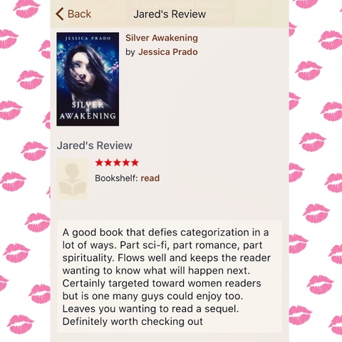
Silver Awakening, both the e-book and the paperback, on September 10th. Originally I had wanted to release at the end of August, but I ran into so many technical issues, and then of course the design process took much longer than I had anticipated. But I think it is better to delay and feel like I have a product that I'm confident in rather than hurry to meet a self-imposed deadline. Well, sort of self-imposed...I have plans to hold a book signing while in California, where I'll be heading to attend a big family/friends event in mid-September, which is why I made the Drop-dead deadline  September 10th. I don't want to miss an opportunity to help spark any potential word of mouth buzz. I mean, I'm an indie author who no one knows or cares about, right? Don't I need all the help I can get?

This has been a long and slightly difficult process. I think as I write my next novel (I'm working on Sins, Hims, and Whims of a Single Mother, but I also just started compiling all my notes for a Silver Awakening sequel, so we'll see which one I finish first.) I need to keep in mind the struggles. During this process I figured out how to make slight revisions to my e-book and I realized that while it is time-consuming, with my art education and background, it wasn't as impossible as I thought it might be. I'd like to try it myself next time...at least for my little Sins, Hims, and Whims novella. Also, I might either lay it out in In-design myself or hire one of my many friends who are designers--even if they are busy and I have to wait awhile. I learned that it is easiest working with friends who are invested in YOU...a lot less back and forth, a lot less feeling guilty for asking to change something you're not totally satisfied with, no debate about obtaining original files--originals offered up stress and worry free. The people who know you and love you just tend to appreciate you more as a person instead of treating you like a nuisance.

Nevertheless, this being said, I also feel the need to brace myself. One thing I'm certain of is that those who love you and support you are typically not as hard on you and your work as faceless strangers and armchair bloggers. This is why I've felt the need to make my very first self-published novel the best it can be.

This journey began in 2008. It's finally coming into fruition. To be determined...


- JNP


Tuesday, August 25, 2015

Silver Awakening Print Proof


9/30/15 Update to this Post: I actually DID CHANGE MY MIND about this after I saw all the widows and orphans in the original interior layout as well as a horrible printing issue where the letter D would print as a big dot (CreateSpace issue not a formatting issue). Eventually, I was able to regain control of the working interior file...I'm grateful to my formatter for being willing to release the file to me so that I could get the printing issues and layout troubles fixed. She was super sweet to work with me and another designer as a team, so that I could get to a more polished and professional look without increasing my budget. (My formatter didn't charge much at all. She basically laid it all out the way I had instructed but then wasn't able to clean up widows and orphans or headers without going over the allotted design hours, so we had to improvise.) Once I had the working file, I then coordinated with another designer who has a lot of experience with book interiors (she's designed for larger publishers than lil old me). She offered consulting services that I so appreciate. Both designers have received credit in my book for their work. (Please note: I did the interior design editing/revisions myself, though, so if anyone takes issue with it this is all on me!...I feel good about it, though. Really good. I have a BFA from USU and as part of my art program I had design training...introductory but sufficient...thank goodness for it too. It came in handy.) Aside from the interior, the cover looks even more awesome now that colors are printing as intended. See snapshots of the new, and hopefully, final print proof here.


Original Post:

I received the print proof of my debut novel, Silver Awakening! This is so exciting! I love it. 

I've debated over page inserts...not sure it matters anymore… I think saving trees and money was the best choice.

I've changed my mind a million times about the cover, whether glossy or matte finish...I like the matte finish. It looks very mature.

So, here is a sneak peek of my book, which if after I read through it and proof this hardcopy it's deemed good to go, then I plan to release it on September 3rd. It'll be releasing on Amazon, Kindle, and Nook. FYI The e-books will not have the graphics or same pretty interior that the print edition has.

Stay tuned for more updates.


- JNP


Tuesday, August 18, 2015

Oops. My bad... Thanks lil bro!

I'm currently experiencing that dreadful nightmare of a moment when I'm past the point of no return, but I really want to turn around and go back and redo something...

I should've SPECIFICALLY named my brother AARON MICHAEL PRADO in my acknowledgments. I did thank my family and friends generally, but I completely forgot about a special contribution that he made to my book. So, I gave him an Instagram shout out tonight...


...I know it's not the same, but I hope you'll forgive me. I love you little brother.


Monday, August 17, 2015

Glossy or Matte: The great debate.

I was having trouble deciding if I want a glossy cover or a matte cover on my soon-to-be-released novel, Silver Awakening. I hold a BFA with a photography emphasis, and when it comes to photo prints I know that I prefer the mature look of a lustre finish, which is semi gloss, a balance between matte and glossy. Then, as I looked at some of my favorite book covers, I noticed they were all matte finishes. So, I ordered my print proof in matte. I'm second guessing myself tonight though, which is normal for me. I keep thinking, "Wouldn't glossy make the title pop off the image and enhance the glow effect more than matte?" 

I have debated a million times over the details of this book, like page inserts for example. "Do I add page inserts to make the chapters always start on the right side, or not? Don't I want to separate the copyright page from the dedication?" Page inserts drive up the cost though, which I think is already pretty high. I had to price my book a few dollars higher than I had intended just so I could maintain a decent profit margin across the various distribution channels. I guess it's kind of a long book compared to some others in the fantasy/paranormal category, but it doesn't seem that long reading it. It's not like Game of Thrones or the last four Harry Potters in length. Mine's only 328 pages total. My husband says I'm stressing about details that nine out of ten people would never even consider. "Okay. Fine. I'm obsessing. It's my baby. What can I say?"


In the end, frugality wins over most of my preferences, and I hope it's not a noticeable loss. But the pagination of the interior is all me, exactly how I envisioned, precisely as I had asked for from my formatter...which wasn't a cinch to get to, but it got there. I asked for drop cap. I got drop cap. I asked for the moon graphic on the chapter headers with the chapter number and title centered on it. That's what I got. It's beautiful, how I imagined it could be. Besides, if I wanted to change it now to add additional inserts, my formatter would have to go back and renumber pages, which at this point would be another additional cost to me. So, my penny-pinching self is settled on the interior. Now, if I could just come to terms with the cover...Matte?...Glossy?...Matte?...


I'm excited to see the print proof though! Looky...it's on it's way!!


JNP